Submitted by Jon Reed on
Some time ago, Google began developing a "visual language... a single underlying system that unifies the user experience across platforms, devices, and input methods" known as Material Design. In other words, it is an improved interface design meant to streamline the experience and make it consistent across all platforms, as well as just modernize the appearance. With Material Design activated, the navigation controls move to the bottom of the screen, making it much easier to use with one hand, especially if you have an iPhone X or Plus model with a taller screen.
The recent Chrome 68 update includes a Material Design refresh. If you use Chrome on your iPhone and want to check it out, here's how:
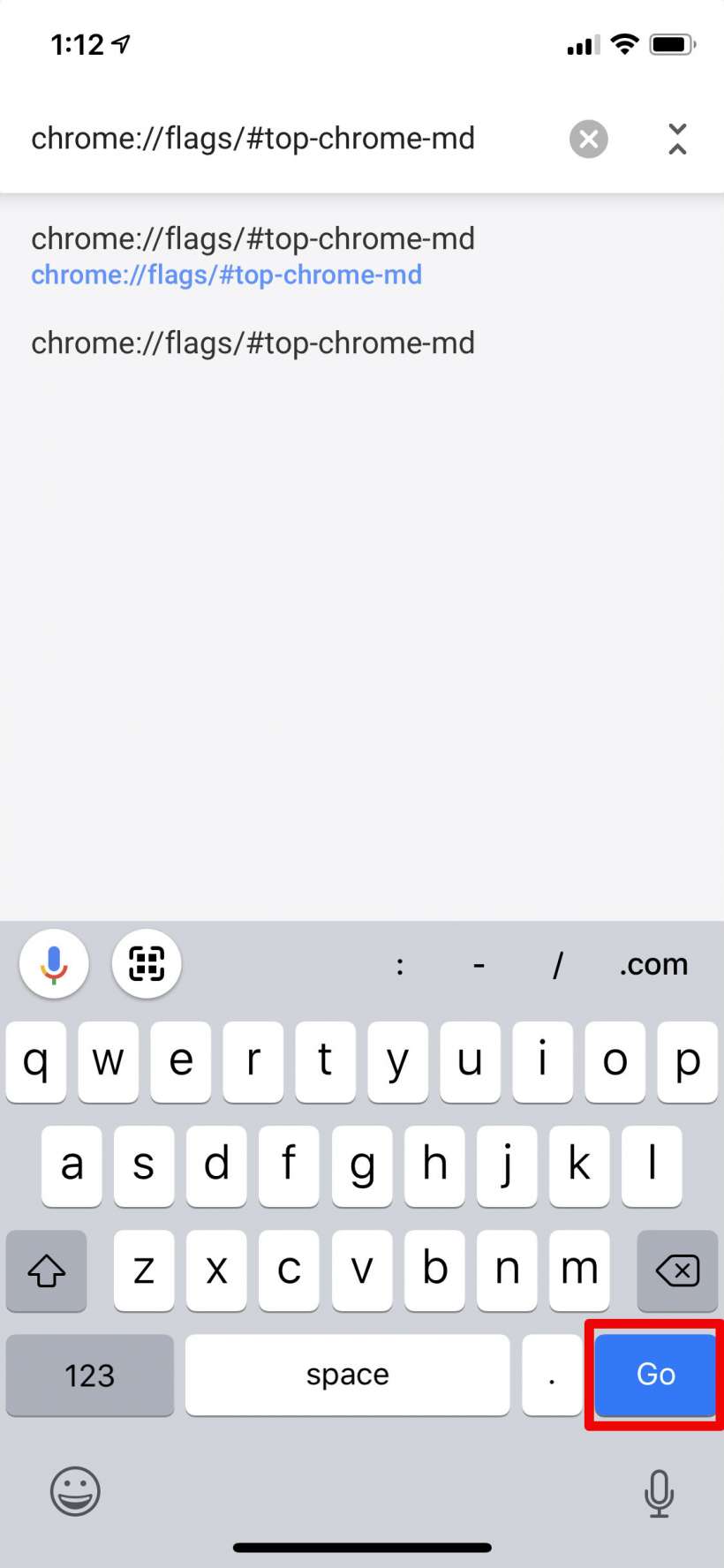
- Open Chrome 68 or later on your iPhone or iPad and enter "chrome://flags/#top-chrome-md" in the URL bar.
- Tap Go.
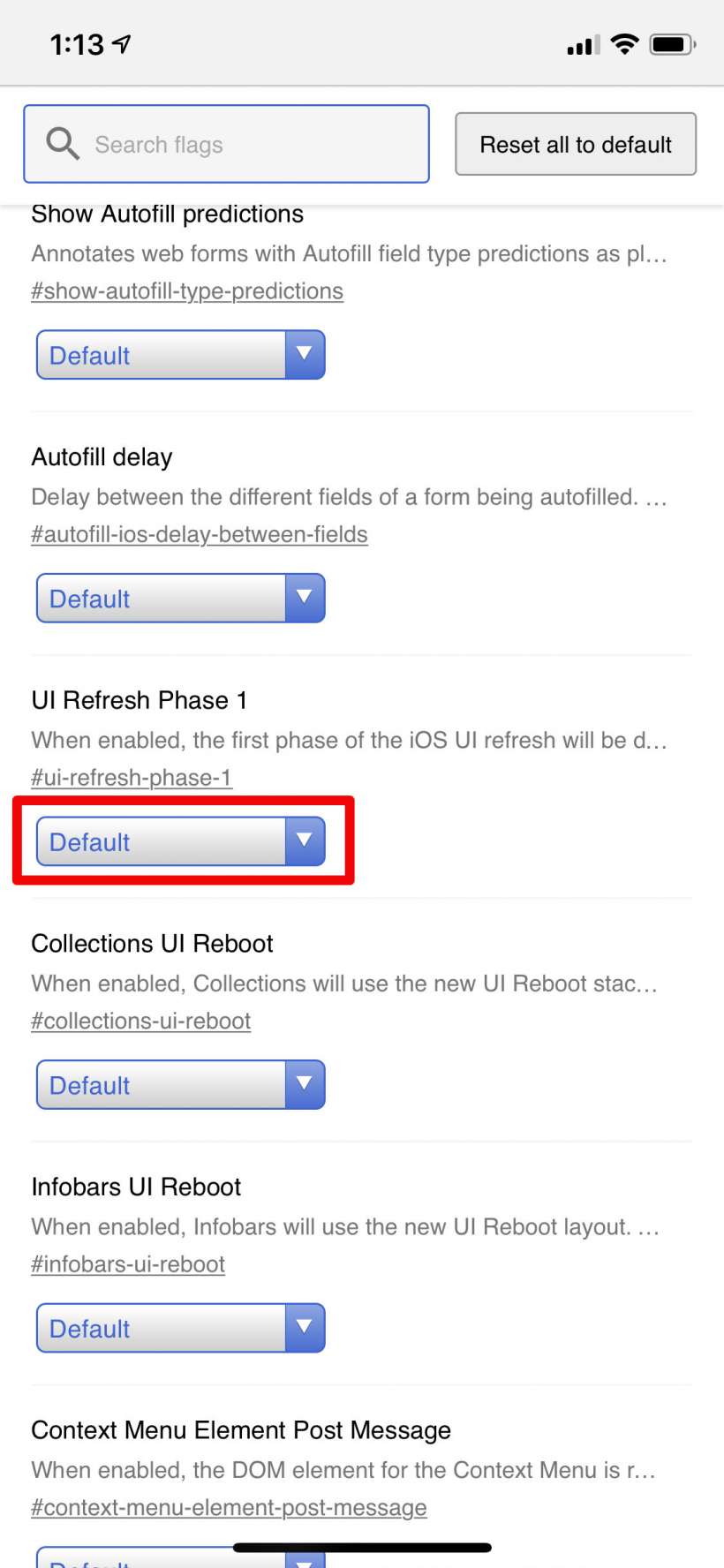
- Scroll down until you see "UI Refresh Phase 1." Tap on the drop down menu.
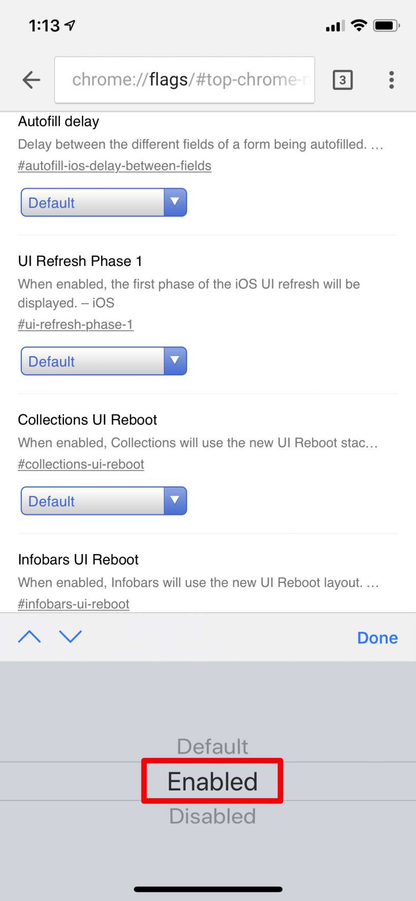
- Select "Enabled" and tap Done, then restart Chrome.
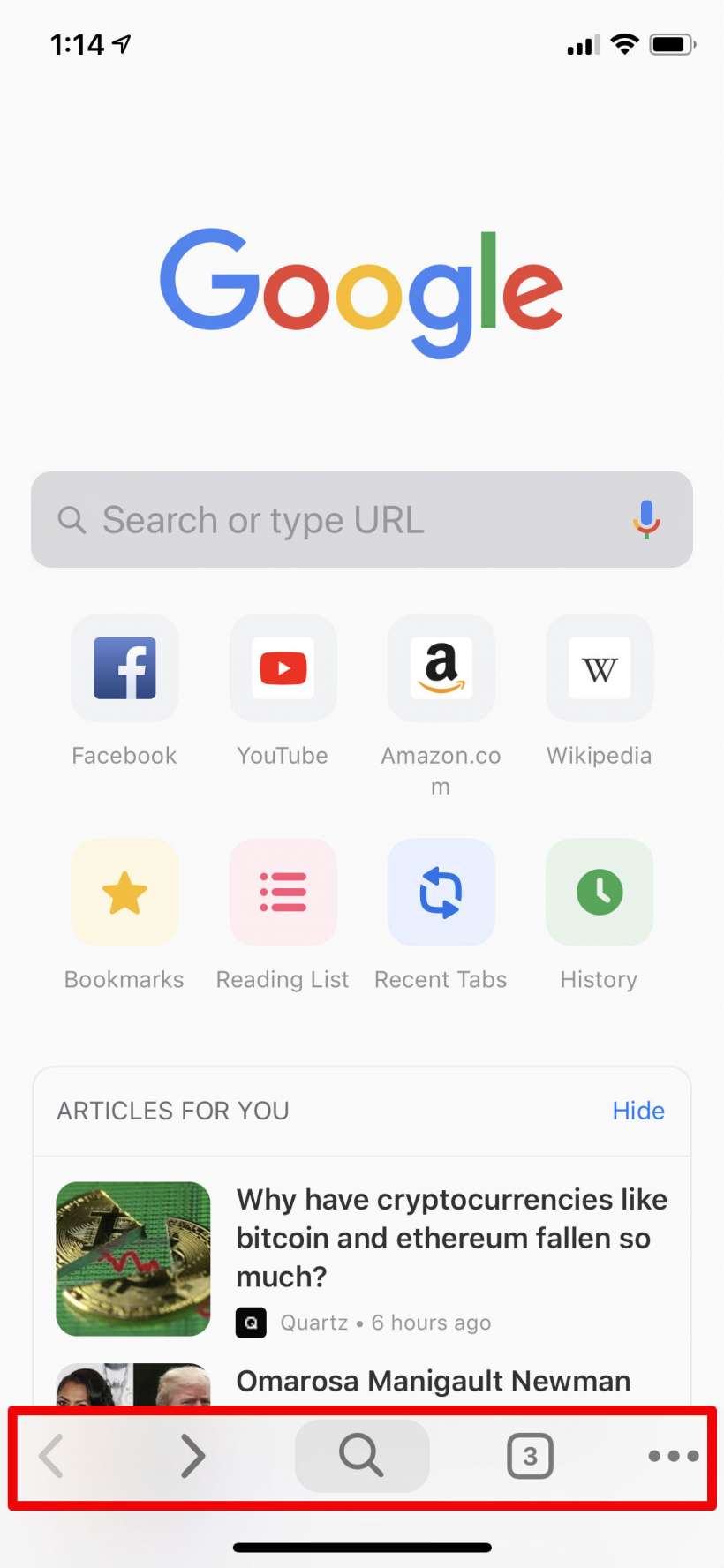
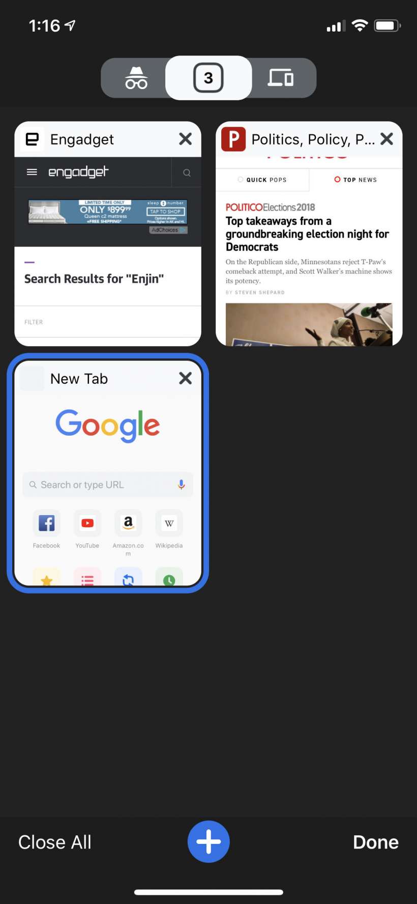
- Now you will see the new interface with the navigation buttons at the bottom, including a new dedicated search button (as opposed to having to use the URL bar at the top of the page to search), making it easier to navigate with one hand. Other areas like Tabs and the settings menu have new looks as well.

To revert, simply go back to the UI Refresh Phase 1 drop down menu and select Disabled.
